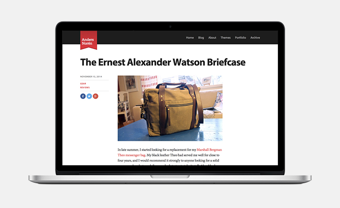
I took a slow start of the year as an opportunity to redesign the blog section of my website.
The new design is a bit more subdued, with more focus on typography and less focus on big background images. The last version was built together with my big redesign of the site this summer. Medium-style article intros with fullscreen background images and white headlines were all the rage back then, and I wanted in on the train. My plan was to use that layout for longer articles, and a much simpler design for small link, video and aside articles.
Over the past few months, I have grown increasingly dissatisfied with that structure. These are a few of the reasons:
- My two article layouts were on the opposite ends of the spectrum: very big or very small. The problem is that as time progressed, I realized that most of my posts end up somewhere inbetween. Those posts had to be awkwardly shoehorned into layouts that were either too big or too small to accommodate the content.
- Fullscreen intro sections require big images, and big images take a long time to load. Finding good images for each article was a hassle as well.
- The disparity between the two post layouts made the theme structure messy.
Every now and then, I would write a big article that would make the hassle feel worth it, but the structure didn’t play to the strengths of nine out of every ten articles I posted. My recent Favorite Stuff of 2014 series of posts is what made me realize that it was time to make a change.
The new blog design is cleaner, faster and a lot easier to work with. There are still some kinks that I need to work out, but overall, I’m very happy with it.
